There are also Ogura Hyakunin Isshu karuta cards translated into various languages.
Ogoola Karuta
Created by Feurst Aya
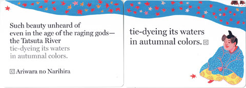
English version
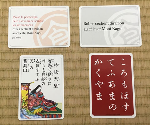
French version
Since 2009, Aya Feurst has been promoting "Foreign Language Karuta," a game played with poems from other countries.
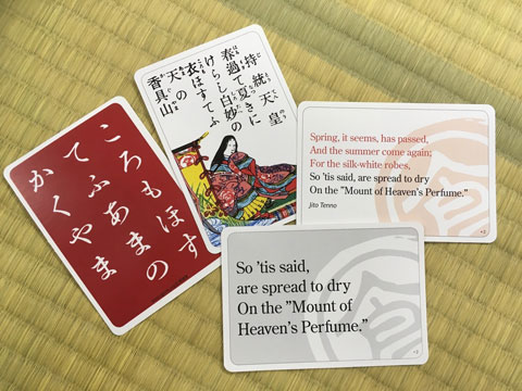
She has translated the Japanese "Ogura Hyakunin Isshu Karuta cards" into many languages and has produced English, Swedish and French versions of the Karuta cards since 2016. Currently, German and Chinese versions are also available.
All products have separate cards for "Torifuda(cards to be taken) " and "Yomifuda(cards for reading)",so you can also play “Kyogi karuta(karuta competitions)".
The size of the cards she produces is larger than Japanese competitive karuta cards, about the size of playing cards. As you can see in the picture, each card has translation of a foreign language on the Ogoola mark and Japanese characters written on the back of it.
English translation by Clay J. MacCauley (1917), using picture cards by Tamura Shogundo Co.
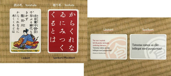
Swedish version
WHACK A WAKA Hyakunin English Karuta
Created by Peter MacMillan
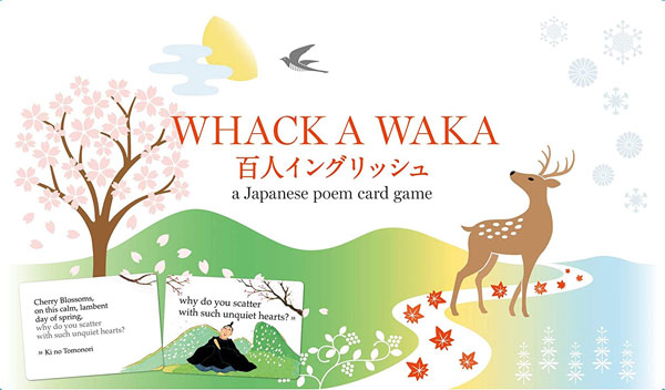
WHACK A WAKA(cover)
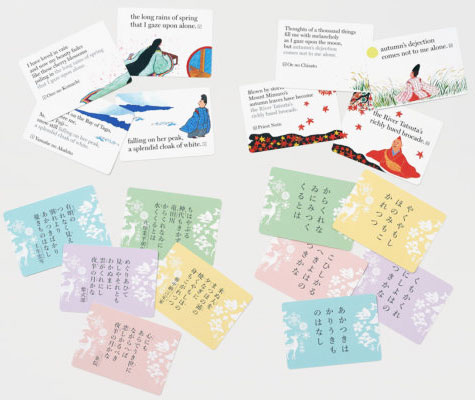
WHACK A WAKA(cards)
"WHACK" is an English word that means "to hit with a snap," and it reminds us of whacking a karuta card. "WAKA" means the Japanese poem "Waka", and "Hyakunin English" imitates the pronunciation of "Hyakunin Isshu" in Japanese.
Japanese literature scholar and poet Peter MacMillan has translated the Hyakunin Isshu into English.
In 2008, he translated the Hyakunin Isshu into English and published a book titled "One Hundred Poets, One Poem Each".
In 2019, he produced "WHACK A WAKA Hyakunin English," based on a new English translation with five-line poems with an excellent rhythm, based on the rhetoric of Japanese poetry and pivot words.
The illustrations on the cards, which depict scenes from the poems, were painted by painter Yasushi Yokoiyama.
Because the English version requires more space, the cards are larger than Japanese competitive karuta cards, and are the size of poker playing cards.
As you can see in the photo, this version of the game is bilingual and the backs of each card has the original poems in Japanese on them, The game is divided into five colors so that each of the 20 cards is color-coded.