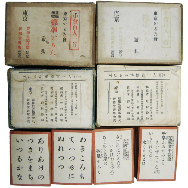
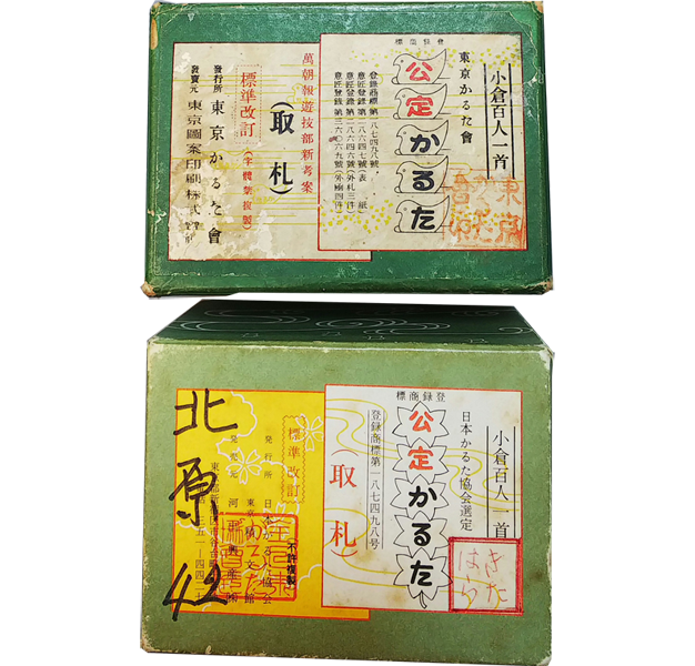
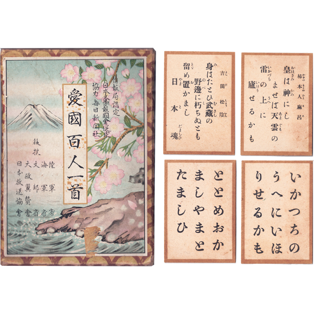
In 1925, the "Standard Revised Official Karuta" was created to standardize "karuta cards". The following article is an explanation of why standardization was necessary, which was published in the annexed instruction manual of that karuta card.
Reasons for revising the Kyogi karuta card
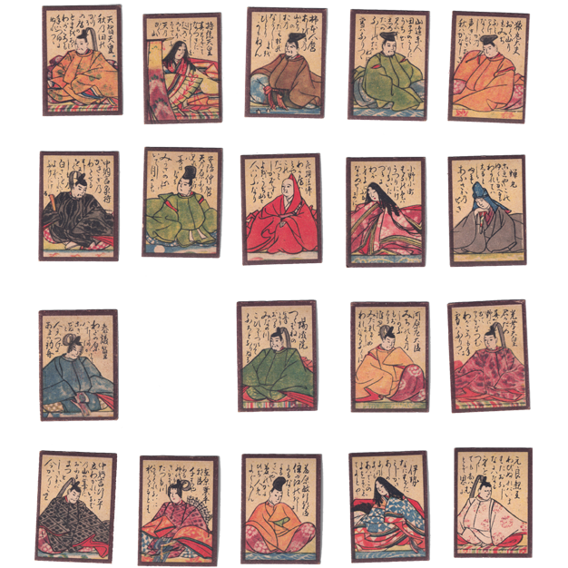
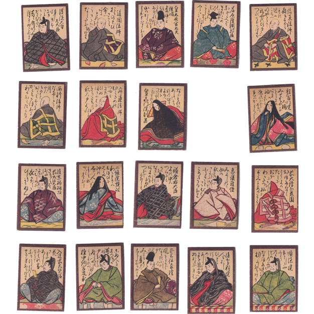
To be fair in the competition, the letters on the Karuta cards must be exactly the same on all cards. Until now, the Karuta cards have been used in a mixture of types that use normal typefaces and types that use "hentai-gana". It was an unfair situation in the competition.
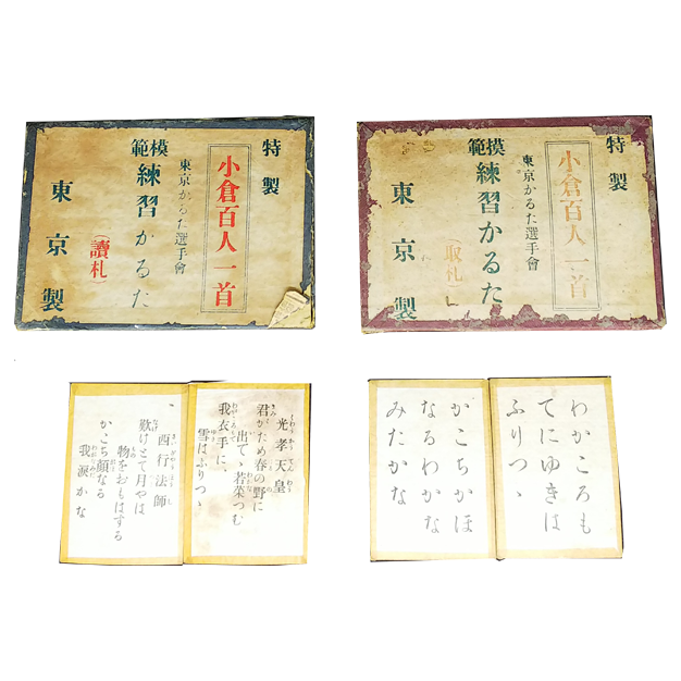
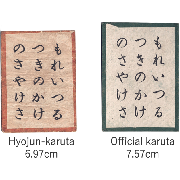
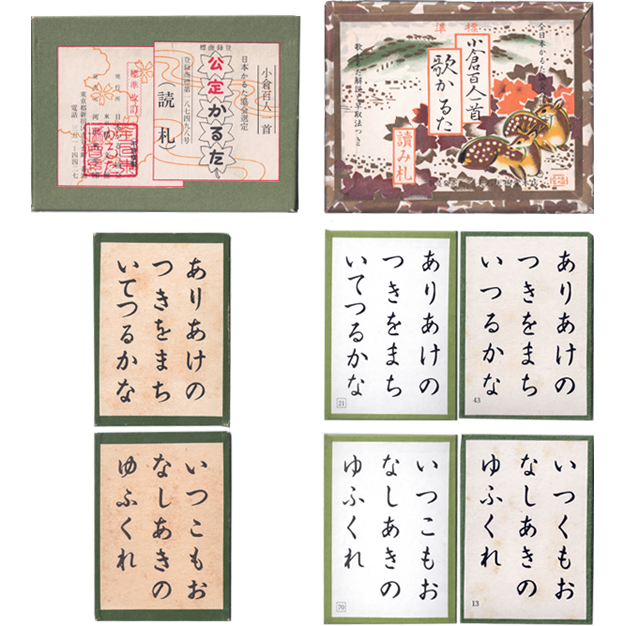
The revised competitive the Karuta cards are based on the standard "Hiragana typeface", and the original version is produced using characters using a brush. In the revised version, the text is slightly larger and bolder than the previous version, making the cards easier for competitors to read and take.
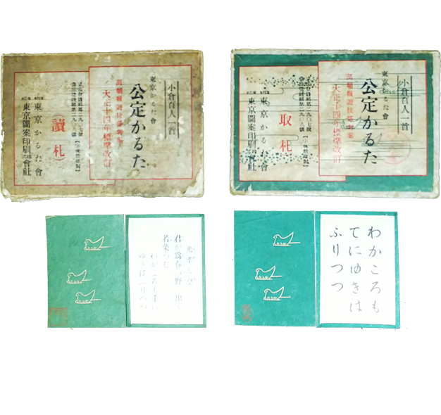
The reason why the backing paper of the card is green is to make the existence of the card clear and to reduce irritation to the eyes. We have also thoroughly studied the original text of the "tanka" (poem) to ensure that there are no errors in notation. This is how we created our club's "Kotei Karuta(Official Karuta cards)".
This is not to say that this Karuta card is perfect. However, it is at least better than the various Karuta cards that have been used in the past.
September 1925 <Tokyo Karuta Kai>
Features of the "Kotei Karuta" (Standard Revised Official Karuta)
Make the lyrics accurate
In the past, there have been quite a few errors in the reading of the lyrics and the names of the poets on the "Karuta cards". In this "Karuta card", all those errors have been corrected.
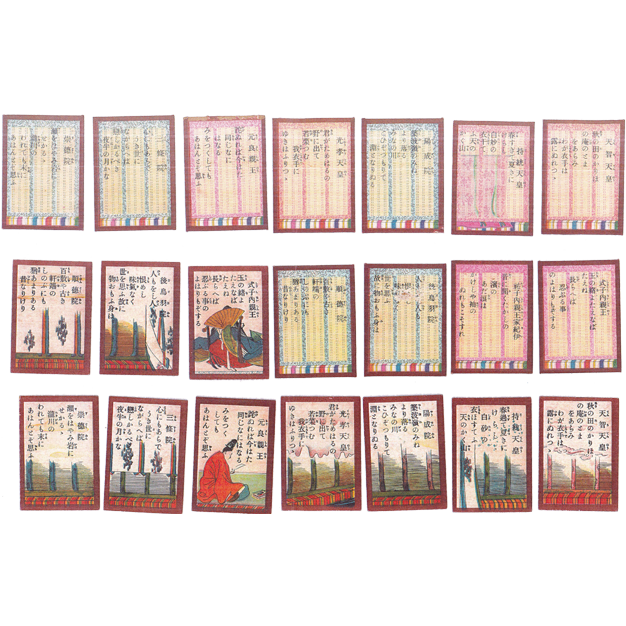
All "kanji" characters in the "Yomifuda(Reading cards)" are marked with "furigana".
In addition, we have made it easier to understand the reading by adding a diacritic mark to the letters that have a voiced sound.
Make the reading cards easier to read
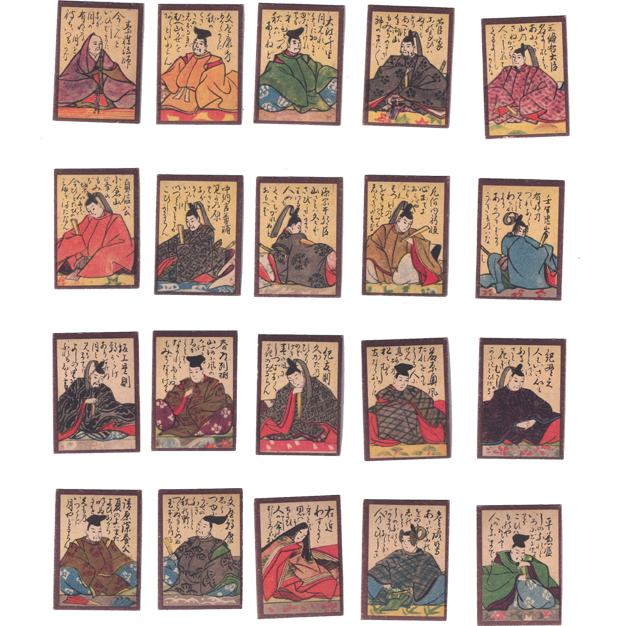
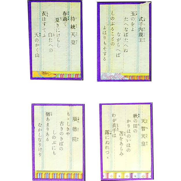
The text displaying the poet's name is smaller than the text in the poem section, making it easier to read the text in the poem section.
We lowered the "Shimonoku" (the last two lines of the poem) by two characters from the "Kaminoku" (the first two lines of the poem). This makes the distinction between the " Shimonoku " and the " Kaminoku " clear.
Make it easy to pick up the "Torifuda"
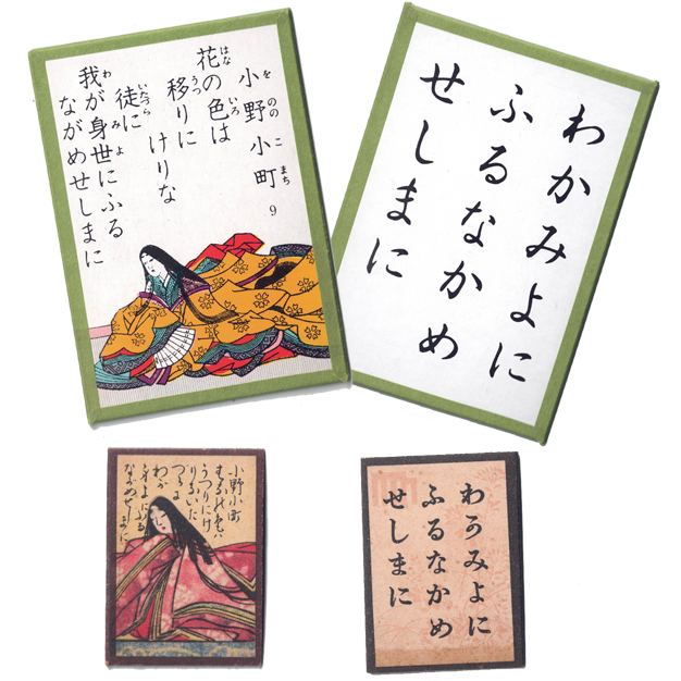
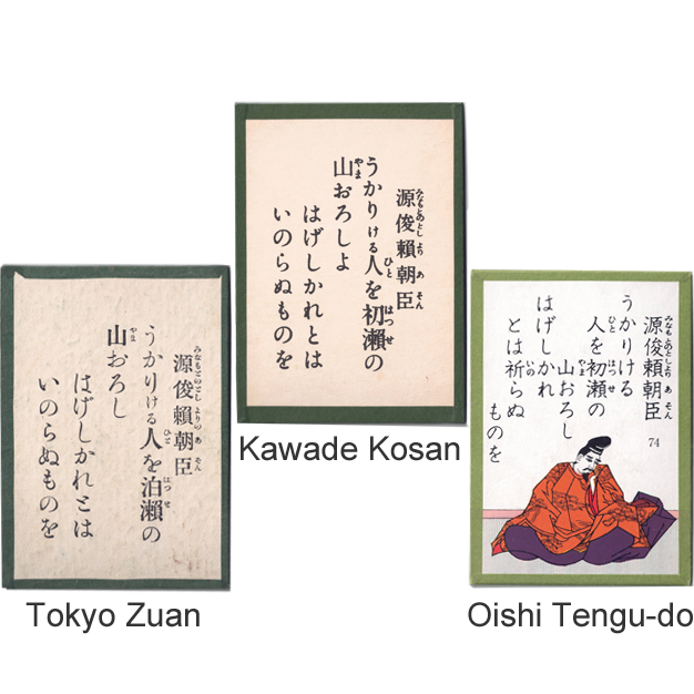
Characters such as  which were previously used as "hiragana" characters, have been unified as "か", "は", and "ゆ".
In addition, the "hiragana" character "む," which was previously written as "ん," has been unified.
which were previously used as "hiragana" characters, have been unified as "か", "は", and "ゆ".
In addition, the "hiragana" character "む," which was previously written as "ん," has been unified.
The font is slightly larger and thicker to make it easier for competitors to read the text on the cards during the competition.
Being elegant
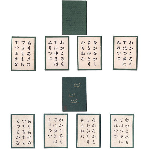
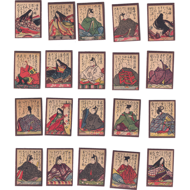
The size of the top and bottom of the card is larger than that of conventional karuta cards, and the color of the edge is green.
On the backing paper of the cards, we put a pattern of the letters of karuta on the bird of Tokyo so that people can imagine "Tokyo Karuta Kai".
The typeface for the cards has been changed from the traditional typeface to a special typeface for this Karuta cards, based on characters written by a calligraphy master.
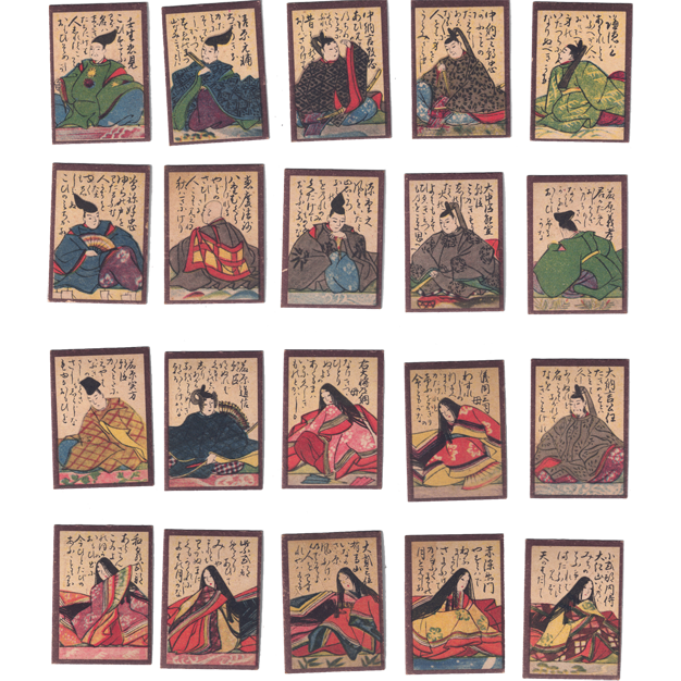
Being robust
Both the backing paper and the core paper of the cards are made of a special product specially designed for "Kotei Karuta" in cooperation with a paper company. Also, the karuta card packaging is so robust that it will never be broken until the Karuta cards are damaged and can no longer be used.
Distributed by Tokyo Zuan Printing Co.